Sunday, 30 March 2014

Claudia Face Chart Four


The fourth face chart just focuses on the eyes making them the main centre of attention. The rest of the face is left bare with just a base for makeup. Once again I will block the eyebrows out.

For this look you will need: 

- Sleek foundation 
- Derma colour camouflage 
- Illamasqua Matte Primer 
- Illamasqua translucent powder
- Sleek Au Naturel eye palette in moss, bark, cappuccino and taupe. 
- Kryolan supracolour or mascara. 
- Glycerine. 

-Create the base with primer, foundation, concealer and powder. 
- Make the smokey eye with the eye palette using the lightest colour in the inner eye to the darkest colour at the outer eye. 
-Block out the eyebrows by moisturising the hairs and then foundation over the top. 
- Place some supracolour under the eye and drag down using water. 
- Place some glycerine over the smudged area to create a dewy effect. (Make sure not to get into the eye.)

Claudia Face Chart Three


Design three goes back to the strong eyed look paired with the ombre lip. Once again the skin is left bare with no blusher etc, and the eye brows will be blocked out to open up the eye. 
For this look you will need: 

- Sleek Foundation 
- Illamasqua Matte Primer 
- Derma Colour Camouflage 
- Illamasqua translucent powder 
- M.A.C chromographic pencil in black. 
- M.A.C lipmix in blue and black. 

- Create the base using primer, foundation, concealer and powder. 
- Block out the eyebrows by moisturising and placing foundation over the top. 
- Line the top eye and under the eye. Wing the top liner out towards the hair line. 
- Create an ombre look on the lip by using the black on the outer edge blending into dark blue.

Claudia Face Chart Two


The second design is taking aspects of the first and developing them. Once again I wanted the main attention to be on the eyes and the lips, however this time being less bold. Also, the eyebrows will be blocked out to really open the eye. The face will also be matte and clear again to keep the attention on the eyes and lips. 

For this look you will need: 

- Sleek Foundation 
- Illamasqua Matte Primer 
- Derma Colour Camoflague 
- Sleek Au Naturel eye palette 
- Illamasqua translucent powder 
- Supracolour (black and darkest red mixed) 


-Start by applying the base. Primer, foundation, conceal and powder. 
-Create a smokey eye using the colours; moss, bark, cappuccino and taupe. Start with the lightest colour, to the second lightest and end with the darker colour and then blend. 
- The lips are created using Kryolan Supracolour palette. The black and darkest red are mixed to create an ombre look. 
- Block out the eyebrows by moisturising and adding foundation over the top of the hairs. 

Claudia Face Chart One


My first Claudia design is based around the eye and mouth being the main centre of attention. To create this look I used: 

- Sleek Foundation 
-Illamasqua Matte Primer 
- Derma Colour Camouflage 
- Rimmel scandal eyes liner 
- M.A.C Chromographic liner in red, black and white.
- Illamasqua translucent powder 
- Sleek face form 
- M.A.C black lipmix 

The idea of this design is that the attention is on the eyes and the lips so the skin will just be clear with a little highlighter placed under the eye. 

-Start by applying the base, primer, foundation and conceal only if the client has blemishes. 
- Start by lining the eyes with Rimmel scandal eyes liner. 
- Use M.A.C chromographic liner in white to line the inside of the eye. 
- Line under the eye and add red in the gap between the top eye line and the bottom eye line. 
- Pull these lines up to just above where the eye creases. 
- Highlight under the eye with sleek face form 
- Block out the eyebrows by moisturising the brow and adding foundation over the top.

Saturday, 29 March 2014

Claudia Hair Design Four


Hair design four takes aspects from other designs. In this design I will use the front left section to hide one eye and then tuck it under a feather choker. The rest of the hair is smooth like the other designs with a strong middle parting. At the back of the hair will be a row of bows. This is my least favourite design as it doesn't have a nice finish. 


Claudia Hair Design Three


The next design has a strong side parting which would be flat to the head and smooth. This will then lead to rows of bows on the back of the head. The design can be done in sections so that every part of the hair is smooth. Once again I would finish with shine spray. 


The end of the hair can be curled to finish the look. However I think this could make the style quire dated.


Claudia Hair Design Two - Chosen Design


Design two consists of the bow look with a harsher finish. The front section will be left on the left side to hide one eye. The hair will then be tucked under a feather choker. The rest of the hair will be pulled to the left side and placed into a bow look. This means that the right side will be slick creating a harsh look. I want the front section that hides the eye to have a wet look. I will also add shine spray to the rest of the hair to help make it look sleek. I think that this is the design that I am going to use to create Claudia, however I want to work on making the hair tighter so it looks completely smooth to the head.


Claudia Hair Design One


Hair design one is based on the character 'Esther' from the film 'The Orphan'. In the film the character is trying to make herself look younger, therefore using bows in the hair. I thought that I could take the bows and turn it into a hairstyle instead. The look here consists of a bow on the back of the head with the two front sections plaited and brought back and pinned by the bow. I don't think that this look says Gothic horror. I think there needs to be a certain harshness about the style for Claudia.


Thursday, 27 March 2014

Dirtying Down face and teeth

Dirtying down refers to making the client look dirty, unwashed etc. This is especially used in the TV and film industry. If you are creating a look that requires the model to be dirtied down, you need to think about the scenes in which the look will appear, for instance if they are in the shower you will need products that wont run under the water. Grease based products would be ideal. Furthermore, always remember to check the ingredients in the makeup, especially if you are on location as some products may burn the skin under the sun. 

No Make-up Look:

- Put on a base making sure to cover spots. 
- Use grease blusher. This won't move under the water and will blend easily into the skin making it look like there is no product there. 
- Use waterproof mascara. 

Taking Teeth Out:

To make it seem that there are no teeth use Kryolan Teeth Paint, which is available from most make-up suppliers, like Charles Fox. 

- Dry the tooth with a cotton bud. The product will not set on a wet tooth. 
- Also apply the product with a baby bud. 
- Using various colours can create different effects. Black completely takes the tooth out, nicotine effect makes it appear as if the teeth have been heavily stained. There are also silver and gold colours available for more fashion looks. 
- Keep the mouth open and allow the product to dry. 
- Use Methys Spirit to remove from the tooth. Make sure that the cotton bud is not dripping in the liquid as it should not be ingested. The spirit also had a strong taste so use a little bit.

Dirtying the hair:

To cheat making the hair look dirty without the hair actually being dirty, you can use various tricks. 

- Use wet gels, hair dressing promade and water sprays to create that greasy effect. 
- Remember that the hair is greasy from the roots, so the product needs to start from the roots. 

Dirty face and hands: 

To create a dirty face you can use: 

- Supracolour Palette
- Dirt, powder concrete and other various powders, available from most make-up suppliers.
- Use stipple sponges to apply. 
- Coloured spray available from Kryolan in various shades, brown and dirty grey are the ones used in the images below. 
- If making up the hands, remember that the grime will need to go under the nail. Stretch the fingers to make the dirt go into all areas of the hand, there should be no white bits on show. 
- Work the product into the hand with moisturiser to make it look more natural. 
- Don't powder the product, use fixing spray to set. The fixing spray is perfect to use in the heat.


To dirty the face: 

- Screw the face up to get the product over the cracks, and then blend. 
- Using the Kryolan sprays to create mud splattered effects. 
- Add red to the face to make them look as if they have been out in the weather for a long time.


Smoky Eyes

To create smokey eyes look at the shape of the eye and the colour so that you can compliment it with the shape created and colour. 

I used Sleek Au Natural to create my smokey eye. 

How To:

- Outline the eye with eyeliner to create the shape for the smokey eye. 
- Make sure to start at the corner of the eye and take it to the outer edge. The bottom lash line starts at the outer edge towards the inner eye. 
- Follow the natural line through the eye from the bottom lash line. This will create the winged look. Avoid creating a Nike tick look as this is not following the line through. 
- Join the top lash line with the bottom and fill in the gap. 
- To create different looks you could keep this clear. 
- To create the smokey eye start at the inner eye with the lighter colour of your chosen palette. Take this to the outer edge of the eye. 
- Where the eye is lined add the darkest colour and blend into the eye and around the crease. 
- Add the second lightest colour to highlight the middle of the eye. 
- Blend all the colours together. 
- If you add water to a powder eyeshadow this will create a thick consistency which can easily be blended unlike grease based products.
- Adding water means that the product wont fall onto the skin. 


Tuesday, 25 March 2014

How to create: Smooth Hair

In order to create smooth hair you will need: 

- Hairdryer
- Shine Spray
- Hair Comb

Smooth hair can be created after blow drying the hair or before creating a hair style. To create smooth hair before placing into a hairstyle you will need to: 

-Thoroughly brush the hair so that all the knots and tangles are removed.
- Sectioning the hair for your chosen hairstyle, take a section and brush the comb through it. Hold the hairdryer horizontal to the hair and blast with heat to create a smooth finish. Pull the brush back to the roots to start again. 
- Repeat the process until all of the hair is smooth to the head with no fly away bits. 
- To finish the look, use shine spray to make the hair look healthy.

  
Holding the hair dryer horizontal allows for the hairs to be sleeked back and made to be smooth.

Adding shine spray makes the hair look healthy

The technique can be used over the hairstyle so that the whole look is smooth.

Saturday, 22 March 2014

Claudia and Quentin Brief & Initial Thoughts


Claudia
Claudia is a girl in her twenties. As a child she was left alone to develop with little parental guidance and through her relationship with T.V. movies developed an unhealthy relationship with Horror films, believing this to be the way life really is.

All the scenes take place in various parts of Claudia’s apartment, which is European in style with a great deal of kitsch décor. She is agoraphobic and is kept in touch with the outside world by her neighbours who provide her with her every day requirements.  She models herself on a variety of girls often twisting her look to suit whichever film she is watching at the time and there is often a nod to the main character in the current film within her appearance.

The script portrays her as psychotic and there is always the feeling that although her character is scripted/can be seen as humorous, danger is just around the corner.   However all this is normal to Claudia and she is of a cheerful disposition in this mad world of hers.

Quentin
Claudia has an imaginary boyfriend, Quentin, who is long suffering and a constant disappointment to her. They don’t live together but he visits regularly and they talk on the telephone if he can’t get in to see her. As he is part of her imagination his appearance changes to suit her mood. Sometimes he will be a Christiano Renaldo/David Beckham looking guy, whilst in another scene he will appear as a Pete Docherty type, Daniel Craig type or a Hollyoaks Babe. If she is having a bad day he will morph into an uncouth couch potato chav with all that brings with it.

He is as into the horror film genre as she and into role-playing to suit her whims and moods.
Claudia has a paranoid suspicion that he is constantly having affairs behind her back and keeps him firmly under her thumb, sometimes restraining him or keeping him prisoner in one of the rooms.


My initial thoughts from the brief is to base the characters on the film 'Orphan', based on a 33 year old woman named 'Esther' posing as a child to be adopted by a family. The mother later finds out that the impostor is actually from a mental hospital. Therefore, I thought 'Claudia' could base herself on 'Esther' as both suffer from some kind of mental illness. I then thought that 'Quentin' could have some kind of mask, like in 'The Strangers', restraining people from seeing his looks, linking to the idea of her paranoia. He could have cuts over his wrists from being restrained.
'Orphan' 2009, Directed by Jaume Collet-Serra. Available to view: www.starpulse.com

Gothic Horror Pinterest

'Great Expectations' Evaluation

Creating a look for TV and film was a lot more challenging than I had originally thought. Obviously because everything is shot in HD now, everything needs to be perfect otherwise any imperfections will be seen so clearly. This meant minimal makeup carefully applied.

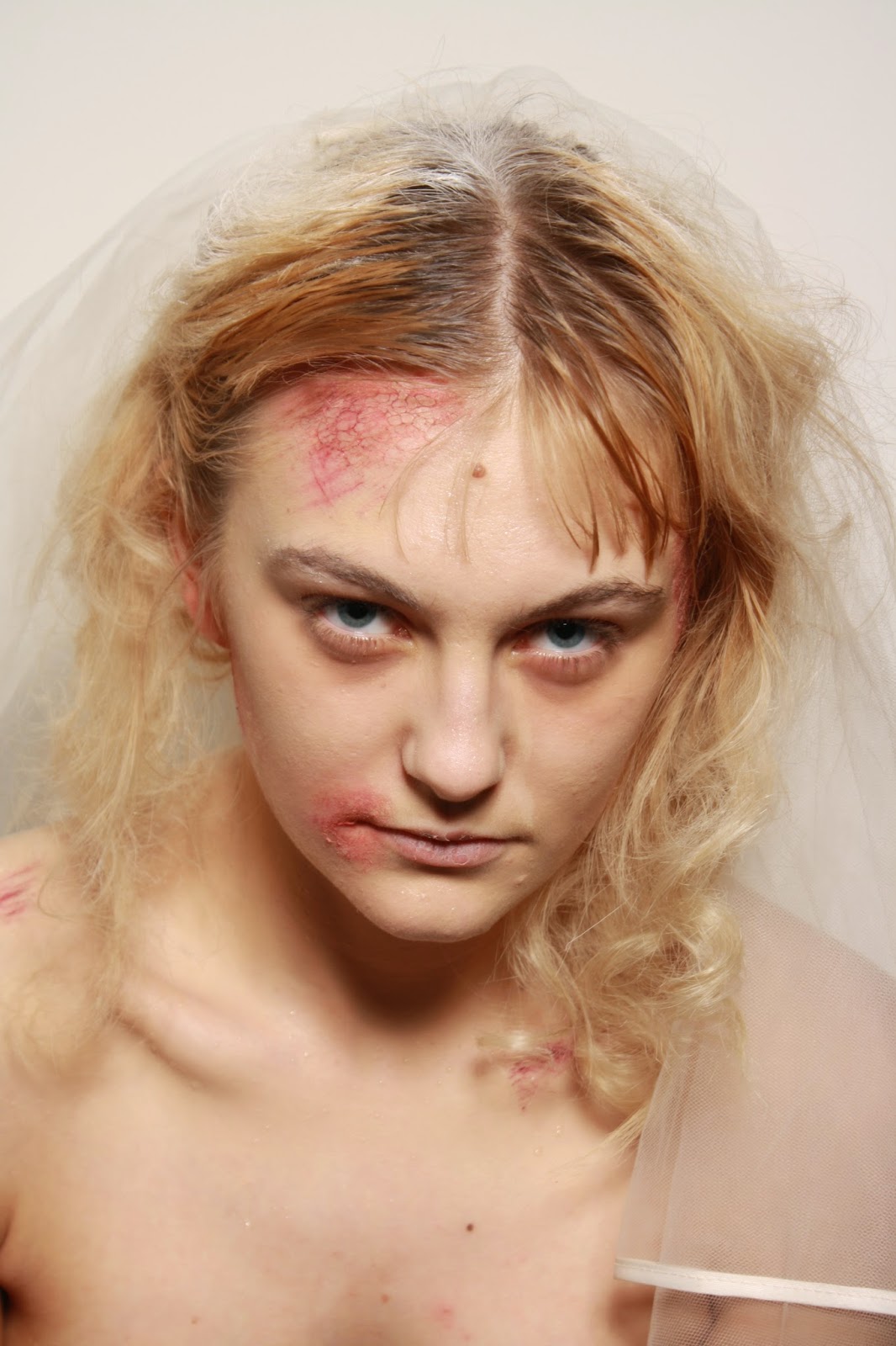
My idea for Miss Havisham was sweaty skin with a gaunt face. Areas of the skin would be red and sore with dry skin, from the veil aggravating the skin. I managed to complete the look within the time given. However, I didn't follow my first face chart therefore some red patches were out of place. So I made a new face chart to follow the first look that I had completed. This allowed me to make the look completely the same. The grazes on the shoulder were added last minute and not documented, so in the second assessment i wasn't sure were to place the graze and how intense it should be. The hair was a simple bun hidden by a veil. I used dry shampoo in the hair to create grey hair. However, I was not happy with this as you can see it on the hair, it hasn't been brushed through properly. I prefer the hair in the last assessment as it wasn't covered in dry shampoo. Estella was simple, natural makeup with curls to frame the face. My face chart was accurate and easy to follow, so this time the design was exactly the same as to what was put on the model. The hair was a simple braided bun with curls at the front to frame the face. I wanted to make the look simple as I think Estella was more naturally pretty.

Overall I am happy with the looks I have created and have definitely learnt from the assessment about how important it is for things to be precise and continuous.


Two images above - first assessment

Second assessment image


Second Assessment Image

Estella

Estella Image

Tuesday, 18 March 2014

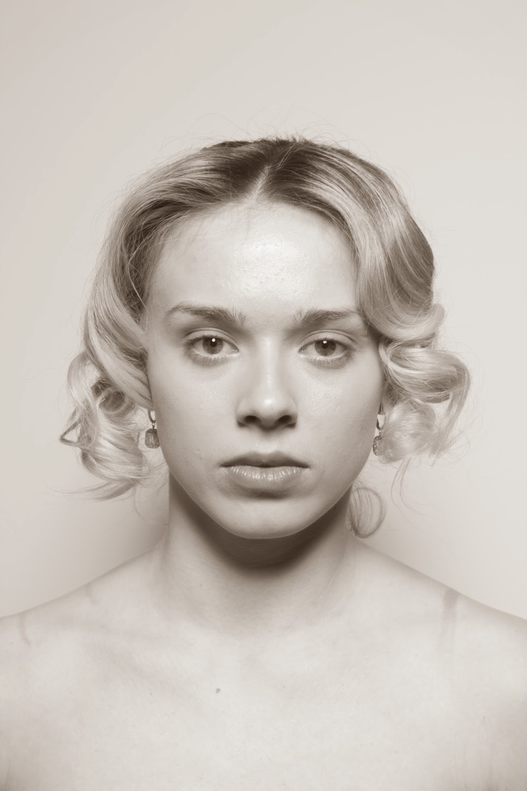
Makeup & Hair for Estella


 The hair consisted of two pigtails braided and then wrapped around each other with curls pinned up from the bottom.


The front of the hairstyle was constructed by pinning the curls up when hot and then releasing when cool. As you can see here the makeup is natural, with tones of pink and brown. The lip was a lip gloss which turned out too shiny and bright so I powdered over the top to create this matte effect. I wanted to keep the eyes natural as women weren't allowed to wear makeup in the Victorian era. I like the shine to the face, this gives the model a healthy glow which I think Estella would have had in comparison to Miss Havisham's ill complexion.

Estella Images


My idea for Estella was to keep the look really simple and natural with hair to frame the face. I pinned curled the front section of the hair to create the wave to the hair which created different shades for the black and white image. The hair at the back was put into a braided bun with curls hanging at the back. The makeup was natural, with tones of pinks and browns. I wanted to use highlighter to bring out the cheekbone to show that Estella may have to been sweaty from the oil lamps. I like how in the first image you can still see some darkness under the models eyes. I think that this shows the strain on Estella. Also, the marks on the body from the models bra (not intended to be there) work as it could  be signs abuse from her husband.

Wednesday, 12 March 2014

Estella - Face Chart Four


For Design Four, you will need:

- Illamasqua Satin Primer 
- Bare Minerals original foundation in Golden Fair 
- Derma Colour 
- Sleek Au Naturel 
- Illamasqua translucent powder
- Illamasqua Pure pigment in Furore 
- Illamasqua Tremble Blusher
- Illamasqua Move Lipgloss

From all previous three designs I have seen that bold colours would not work and that I need to make Estella more natural, as she would have been. Therefore my final and chosen face chart just uses pink tones. I have put on the face chart that I will use a lip gloss, which I think will create a finish to the lip when pictured in black and white. 

Estella - Face Chart Three


For Design Three, you will need: 

- Illamasqua Satin Primer
- Bare Minerals original foundation in Golden Fair 
- Derma Colour 
- Sleek Au Naturel Palette 
- Illamasqua translucent powder 
- Illamasqua Pure Pigment in Furore
- Sleek lipmix 

Design three takes on a more natural look which would have been more acurate to how I think Estella looks. However I don't like the bold lip or eye. I think the tones need to be more pink then red. 

Estella - Face Chart Two


For Design Two, you will need: 

- Illamasqua Satin Primer
- Illamasqua Rich Liquid Foundation 
- Derma Colour 
- Sleek Face Form 
- Illamasqua creme in Laid
- Illamasqua Resist lipstick 

I wanted to use bolder colours to show up different tones for the black and white imagery.Once again however, I think this look is more modern and doesn't represent the time period selected.

Estella - Face Chart One


For Design One, you will need: 

- Illamasqua Rich Liquid Foundation 
- Illamasqua Satin Primer
- Sleek Garden of Eden Palette 
- Illamasqua translucent powder
- Sleek Face Form 
- Sleek Siren Lipstick

I will not be using this design for the character of Estella because I think the colours need to be bolder or more pigmented because it is being shot in black and white. I also don't want to use lipstick as it would not be true to the Victorian era. 

Sunday, 9 March 2014

Comparison of Miss Havisham

First Assessment 

Second Assessment 

My first assessment was definitely more subtle then the second. I think the colours are blended better on the first however I like the skin colour more on the second. The graze over the collar bone on the second should have been on the shoulder, this needed to be something that I wrote down to remember. Also the hair needed to be pinned back from the face so that you could see the grazes and dry skin on the side of the face. Saying this, I think the rest of the design looks the same and has been re done to the same standard.

Close up images of second assessment